Ramekins Email Marketing and Digital Strategy
Project Overview
A recent change in ownership left a bustling catering business without the design and marketing teams they relied on in the past. Though I was commissioned to redesign their website with UX principles, I was also asked to assist bringing their marketing strategy up to speed.
- Email Campaigns (Live)
- Design a cohesive email template that can be utilized for future campaigns
- Apply user experience guidelines that help the user to register for a cooking class easily and efficiently
- Add a seasonal flare to the email aesthetic influencing the brand and Ramekins focus on fresh seasonal foods
- Other areas of focus:
- Marketing Management
- Campaign/Project Manager
- Graphic Design
- UX Design/UI Design (Website in Development) View Case study

Designer/Marketing Manager

Ongoing Contract

1 Person Team
Problem Statement
Ramekins found themselves without needed support in design and marketing. Ramekins was struggling to capture the design element needed to appeal to its users and missing the mark in functionality with a lack of strategy, context and CTA.
Solution Statement
I developed a marketing strategy that encompassed email marketing, online and print advertisements as well as templates with guidelines that will insure the future of Ramekins business goals.
Research
Empathizing with Ramekins and their brand
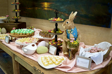
Ramekins is a cooking school and catering service. It’s aesthetic has largely been natural grey table cloths, concrete walls, wooden tables and earth tones that enhance beautiful flower arrangements and gorgeous dinner platings.
Current Email Campaigns
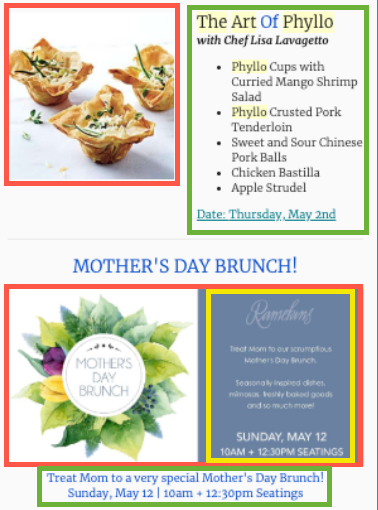
I reviewed past and present email campaigns designed by the prior Ramekins Marketing and IT teams.
- Limited brand consistency
- No context for cooking classes descriptions,
- Poor structure and no sense of hierarchy
- Call to Action buttons needed to help users make purchases
- Varying typeface
Ideation
Sketches
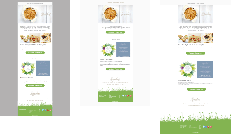
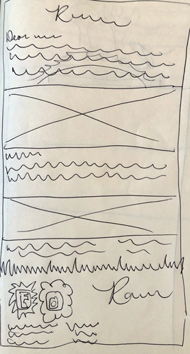
Ramekins suffered from a quick transition in management. They needed a structure and direction so I created a design that was simple and easy to follow.
- I started with a summary that would introduce the user to the purpose of the email which was to sell a feature class.
- I opted for a stretched image with description below to keep the email consistent with wider images that have text.
Lo-Fidelity Prototype
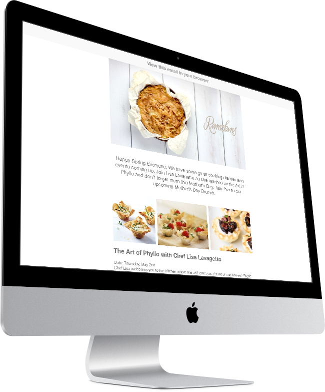
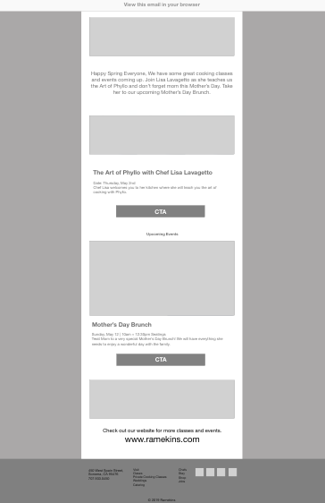
Keeping the email light and breezy was important for the brand. Having a main focus and including the must sell options within that main focus was crucial.
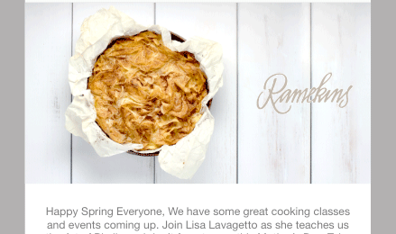
- A pleasant Hero image
- Opening text summary of email
- Scan-ability and Hierarchy
- Call to Action buttons
- Links back to the website for quick navigation
Design
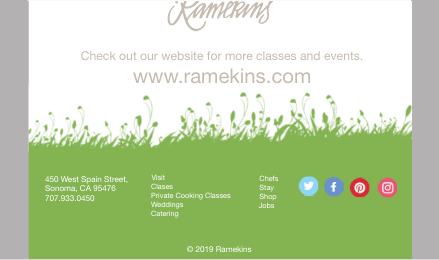
The core colors were Grey, earth tones and of course gorgeous food. Think Restoration Hardware Sheik. My goal was to return them to this. But I asked, “Why green?” They said they wanted to present a spring vibe.
- Pic-Nic table that would be seen at a Sonoma home
- Lush Grass that would bring anyone back to wine tasting in the countryside
- Neutral Colors that stay true to their brand.

Next Steps
Ramekins is nearly ready for the unveiling of the new website. In the mean time they can continue to market their business and receive the respect they continue to deserve through smart digital marketing and email campaigns.
