Building a Better Bridgit

Imagine that you are reading an interesting article online. Suddenly, you read a line that would be extremely useful for a blog post you are writing. You could source the info and link back to the page, but this is a really long article – How will your readers find the part of the page you’re referencing? They’re lost! What if you could share the exact coordinates of the exact sentence instead?  You just won another reader’s trust…

Bridgit is a Chrome Extension in early Alpha that enables users to make connections between pieces of content (IE. Text and images)  on any website to help verify blog posts, combat fake news and create a web of community driven information. This is called bridging. 

Project Overview

  • Primary objective: Extend the beta’s bridging capabilities to video. 
  •  Secondary objective: Improve the user experience.
  • Stretch Goal: Implement an onboarding experience to enhance understanding of what a bridge is.

Lead Designer

3 week sprint

4 Person Team

Problem Statement

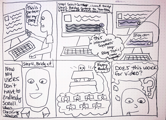
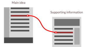
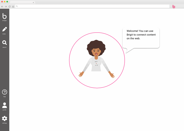
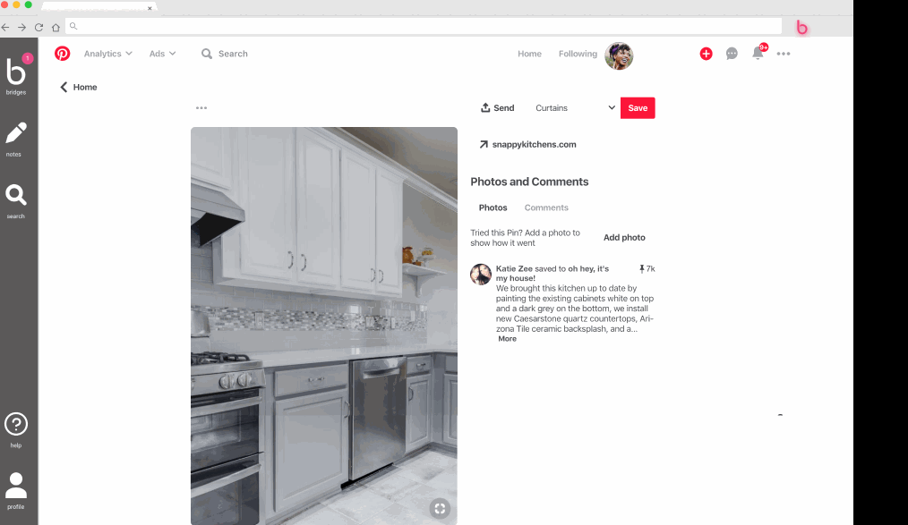
Bridgit in its alpha, Currently allows people to bridge text to text and text to pictures.  It does not currently support the ability to bridge further to video content. Video for many is a key element for browsing the internet. We need a way that easily helps the user cut through the clutter and connect ideas for all content in a meaningful way whether it is text or video.

Solution Statement

We need to enhance Bridgit in a way that helps users understand the product better and stretches beyond its current limitations of text and pictures.  A video UI that helps users to specifically select a start and end range within the video can eliminate searching the entire video for 15 seconds of content. By building out this tool further we increase understanding and user retention giving users tools to verify facts, helping them collect ideas and rise above traditional internet browsing.

Research

Comparative Analysis

Hypothes.is is an extension that provides annotation functionality of websites. 

  • Side Panel design allows the user to invoke the tool at optimal times.
  • Nav Bar Extension icon fills in when in use.
  •  You can take notes with this tool as well.

Pinterest has great user engagement and organization of ideas. 

  • Great tools for following influencers and pinning content. 
  • Fantastic way of organizing ideas and showcasing how users could interact with content on  a dashboard. 
  • Pinterest houses a lot of content that could be used in conjunction for users bridging items.

I looked at sites like Youtube, Vimeo, Dailymotion to see how they were displaying video content. 

  •  All Three services have a thumbnail when hovering over the navigation bar. 
  • Upvoting, commenting and flagging tools available for content.  

User Insights

We conducted a contextual interview of the current alpha product and we found that the current UI was daunting for most users.
Bridigit informed us that their target audience is Students and Academic researchers. We received 33 responses from our survey and conducted 18 interviews with participants in this target group.
  • Users wanted a better way to organize their internet content.
  • Credibility features implemented in their web experience.
  • Users also wanted a way to weed out bad information.
  • Pop ups were very frustrating to the majority of users. 

We asked Academics how they interacted with video which yielded some unexpected results.

Pivot Moment

The primary goal was to implement video. But our current participant demographic did not rely on video to back up academic research. After consulting with our client we made a decision to interview a broader audience to see how people were using and interacting with video.  

Findings - # 1 Learn a New Skill!

  1. Learn a new skill
  2. Entertainment
  3. Complete a task
  4.  News/Politics
  5. Adult content
  6.  Academic research (last)

Persona - Sally the Skill Seeker"

User Flows

In the first image you will see that the current iteration of Bridgit has limited functionality and does not support video. In the Second user flow you will see the implementation of video

Ideation

Initial Sketches

Iterations showing the video process

After testing with users we were confident we needed to move forward with the side bar. But we now needed to work on a clickable prototype. 

Lo to Mid Fidelity Prototype

We tested different interactions for managing multiple bridges within the bridge panel.

Usability Tests

During our usability tests people were having trouble understanding the product. It was clear that the onboarding process was no longer a stretch goal, we had to prioritize it as a deliverable.

Pivot Moment

Stretch goal becomes a must! After hearing from our original testers, iterating and then hearing from our usability testers. We could not ignore the fact that Bridgit was so cutting edge that users just didn’t understand it’s purpose or how to use it. We simply had to implement an onboarding element.  

Solutions - High Fidelity

Implementation of video

We needed to overlay our UI on any existing website and it needed to be visible on all backgrounds. The user needed to be able to distinguish between our UI and the current website UI.

WHAT WE DID

  • We utilized a black background with high opacity so that the user could see the overlay with additional features. 
  • We used Bridgit’s bright pink colors for contrast
  • We created signifiers for the user to move forward by indicating next steps

Onboarding

To make Bridgit successful we had to implement a crucial feature into the new prototype. We needed to explain Bridgit,  how to use it and why they want to use it. 

WHAT WE DID
  • We implemented “Onboarding with Bridgit.”
  • We created a fictional character based on the company’s name.
  • We provided instructions on how to to access Bridgit.

UI and Bridging Process

We heard from users and they did not like the current interface, We got to work creating a beautiful interface that anyone want to use. 

WHAT WE DID

  • Implemented a side panel that users could invoke when they needed it and close when they didn’t need it. The key is that users know it is always available to access their bridges when they need it. 
  • We utilized the Pink colors of Bridgit for contrast and a dark UI for a sleek professional experience.
  • Added a notification to panel to indicate a bridge is in process.

“I am impressed on how your team transformed the minimalist interface we started with into an intuitive and easy to learn UX/UI and radically better on-boarding process. The list object that your team envisioned and brought to the project is a game changer both for on-boarding and for the utility of the system. Thanks for your insight and for making meaningful magic in three short weeks.”

— CEO, Daveed B.

Thank you!