I was approached to create a historic walking tour experience for the Sonoma Plaza which is home to many amazing historic landmarks.
Iconic buildings line the plaza and are some of the first structures ever erected in California. These represent pivotal moments that helped shape the cultures and the California we know today.
The Brief
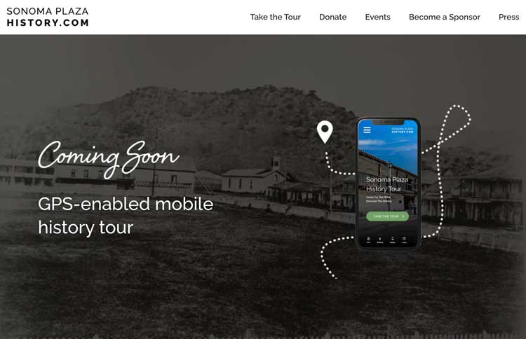
Create a mobile walking-history tour that teaches visitors and locals about the history of Sonoma
GPS-enabled to help people walk to each stop easily and efficiently
Audio Narrations available in English and Spanish
Engaging content like photos and videos
PROJECT TEAM
The Sonoma Plaza History Tour was made up of many creative specialists. I was in charge of the design and development of the application.
My Roles
Product Design, User Research, Product Management, Visual Design, Content Strategy
Team Roles
Founder, Fund Raisers, Marketing, Content Writers and Historians, Narrators, Photographers, Developers
research and strategy
Comparable models
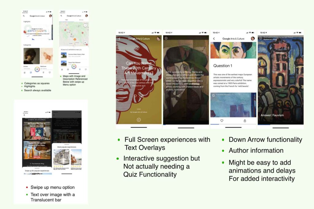
I researched current walking tours, GPS applications and potential technologies to learn about various methods in making educational resources engaging an useful.
user research
I interviewed participants in the Sonoma area as well as travelers visiting Sonoma to understand what they liked about walking tours and learning about cultural tourism.
Demographics:
55+/Retired
Families
History Buffs
Spanish speaking
Culture Seekers
Vacationers
KEY HIGHLIGHTS
Many people were interested in history but needed a motivator to seek it out or make the time for it
Many locals admitted to being embarrassed about there level of knowledge about Sonoma's history
Most willing participants were in the 55+ category, but we also attracted families and history lovers from varying age groups
Many older interviewers feared technology
Interest was very high for an interactive application that focused on Sonoma's history
Content strategy
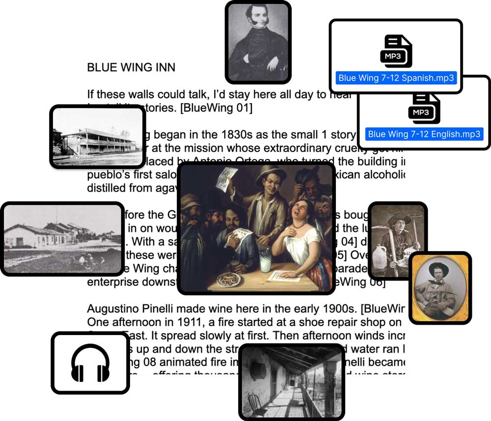
Sonoma Plaza History has historians, researchers, and writers who created history scripts to tell the story of each stop. Several stops were created in the first few months of the project.
Historical researchers would compile the research, write tour stop scripts, and gather photos and content.
decision
UX Writing and Accessibile Content
We wanted to ensure that each stop met the user’s accessibility needs, which meant providing options for both audio and digestible text. I created a system for bullet-pointing the content into quick and easy historic events that tied to various pieces of content to keep each stop engaging and educational regardless of content preference.
equitability
The Sonoma community is largely made up of it’s English and Spanish speaking residents. We wanted to ensure that we met the needs of our spanish community by connecting with and contracting with Spanish translators and local organizations.
I worked directly with translators to ensure we had an equitable product and tested with Spanish-speaking residents. We planned to add more languages in the future.
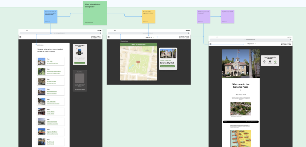
Information architecture
I indexed the various stages to understand the user’s progression through the navigation system. I considered potential problems and cognitive barriers that could affect the customer. This provided the needed signifiers that would be important to keep the user moving through a navigation system without bottlenecks
userflow
The cognitive load a customer experiences when operating a device while navigating real world distractions is very high. So we spent significant amount of time understanding the landscape the customer might experience on this journey. I explored various breaks in the userflow to understand where to present helpful signifiers to keep the customer moving without bottlenecks. This is key to helping the user stay engaged and moving in a real world setting.
Technology
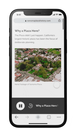
I contracted developers to build a working prototype in Angular to test the technology. The tour is a web application and designed for responsiveness. We integrate with Mapbox API to enable location services and navigation features for an in browser experience. This allows anyone with internet access to access the tour through our website. This makes development more agile and flexible and removes the need to develop native apps for multiple screens.
Design
early prototype
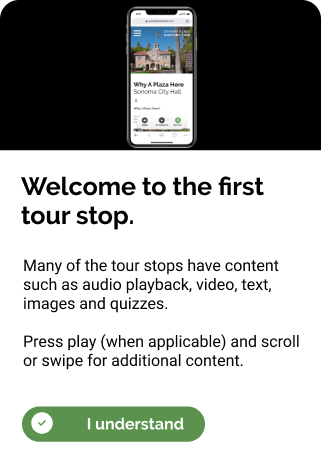
I designed the first prototype to test with real users and understand their problems. It was basic in design, combining ux writing, audio narrations, imagery and a quiz for engagement at each of the first five stops.
Usability Testing
I tested the first working prototype with history fans and Sonoma visitors to uncover any problems encountered. The experience was well received, with testers touting the narrations and overall experience to be fun and engaging.
Younger participants and families had very few issues with the tour and enjoyed the experience.
The 65+ participants struggled with technology and performing functions on their devices.
A wide variety of screen resolutions proved that our current design needed to adapt to improve responsiveness for older devices.
Navigational fatigue proved be a hurdle for many age groups as they wanted to make sure they were following the apps navigation rather than trusting their own intuition
Some users became confused at various spots on the tour related to the GPS signal not launching a stop
Iterations
I continued to perform research and iterate rapidly, fixing various bottlenecks in the customer’s journey to keep people moving and engaging with educational information.
reducing friction in real world situations
Focusing on where you are going is not an easy task when you are holding and engaging with a device.
We examined some users struggling to maintain a sense of direction. Users would get confused if they had to turn around. So we analyzed the directional pathways to understand if there was a way to improve navigational flow.
We found that simply adjusting the order of the tour stops created a seamless flow forward reducing fatigue and keeping the user aware, engaged and in tune with where they were going.
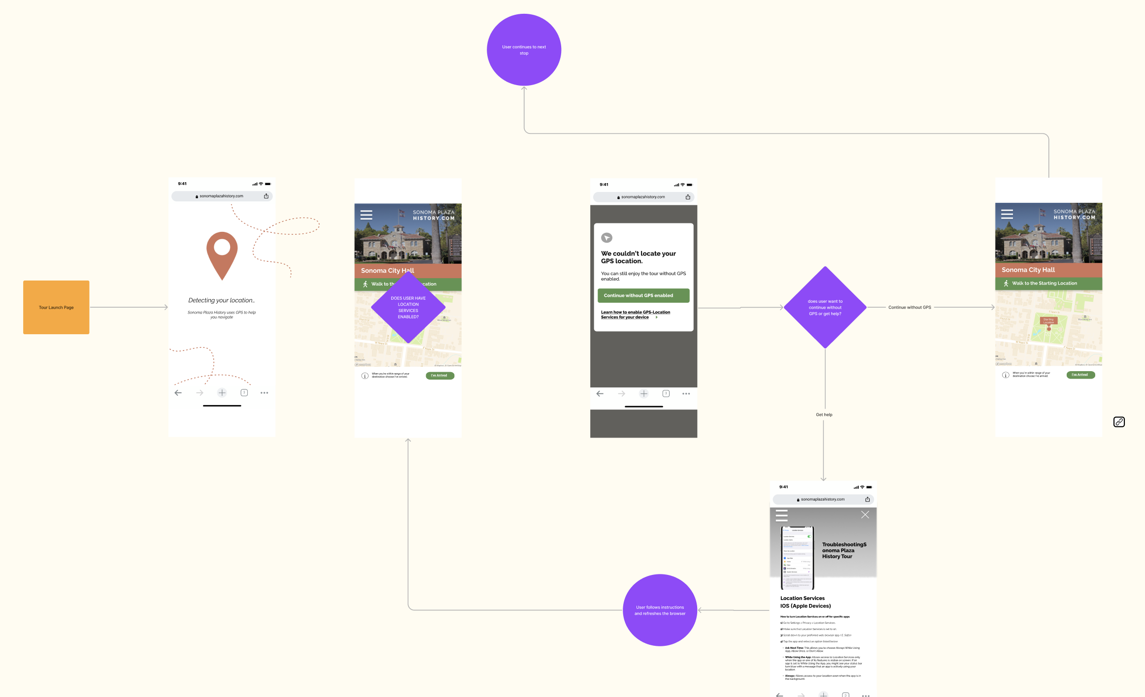
Location Services
20% of the users we tested struggled to connect to location services because of the restricted location based settings they designated previously. So we needed to create a solution that helped users to understand the connectivity issues they were experiencing.
Initially we thought we could provide a walkthrough to solve this, but we soon realized that even the simplest instructions would feel unatural to many people.
To increase satisfaction, we made the tour more usable regardless of location connectivity but also gave people the choice to solve the issue for better navigation features.
signifiers
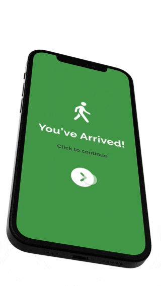
Initially I had designed the system to trigger each stop automatically upon arriving to the designated location on the map, but due to the limitations of location services we had to remove this interaction to ensure all people could move through the system without bottleneck.
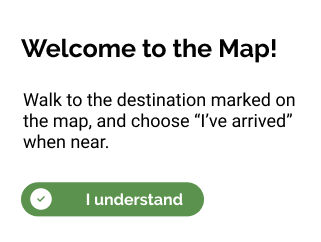
I added additional signifiers to help the user understand what to do next.
reducing clutter and maintaining a clean interface
To help with responsive issues, we adapted the design to a more conventional design.
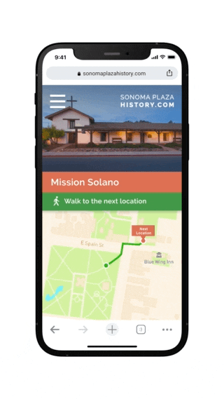
I designed a sleeker, minimal UI that allowed the map to expand to the whole screen and the navigational panel to adapt to more minor elements from small to large screens.
I also lifted the playbar to show that the screen extends beyond the viewable fold and added a “Next Stop” button to keep people moving through the tour experience.
usability testing
Usability results
Though we were able to solve many of the problems we still experienced technical barriers and found that we did not want to lock people out of the tour.
Older individuals continue to navigate effectively due to physical limitations and technical savviness.
Even with improved UI and unreliable GPS for 20% of users was a significant problem.
Problem
Making the tour equitable is paramount to the success of this project but after numerous iterations and testing, many users struggled to navigate the tour due to disabilities and cognitive fatigue of using a device and navigating the real world. Additionally, unreliable GPS for 20% of users depending on their device resulted with a poor overall experience.
solution
The obvious problem was the technical weight that the users were experiencing. The balancing of following prompts on a screen and maneuvering a real world setting was cumbersome for users with disabilities and the GPS technical problems were problematic for all ages. The biggest realization was that we didn’t want to lock people out due to technical restraints. So we pivoted and decided to develop a responsive web application, which empowers users to engage with the tour from their mobile or desktop devices. Since we have already created and incorporated a distinctive detection feature that sensed the availability of GPS, providing an alternative approach to access the tour without the necessity of a GPS-enabled mobile device – It was now much easier to incorporate additional devices like a home computer. This empowers those with physical limitations to enjoy the tour from the comfort of their homes or even at a park bench, it also helps those with location based issues to move about the tour and interact with content without the need for global positioning. By eliminating the need to physically move to each stop to engage with the narrations and storytelling we open up the tour to more people.
adapting the tour to a desktop experience
In testing many people liked the idea of revisiting the tour from home to revisit the story telling and educational resources. After taking away and understanding the users problems with mobility and technical issues that plagued a portion of our users it seemed wise to begin adapting the tour for desktops.
Adapting the experience meant adhering to the different standards for hierarchy and navigation as well as responsive positioning and layout
mobile Prototype
Unfortunately this project was put on hiatus in 2022 due to funding issues and I decided to leave the organization to pursue other projects
It remains a passion project for me and has made a huge impact on my career as it was an opportunity to own a working product from its conception and build for my local community.